Choosing the right house painting colour combinations outside can transform your home’s appearance, boost its curb appeal, and reflect your personal style. Exterior colors are more than just aesthetics they impact how your home is perceived and how well it blends with its surroundings. Whether you live in a sunny coastal area or a wooded rural zone, selecting the ideal exterior color palette requires thought, creativity, and a basic understanding of color harmony. With the right combination, your house can feel timeless, bold, cheerful, or elegant.
Understanding Exterior Colour Psychology
Colour psychology plays a significant role in exterior design. Different shades evoke different emotions and moods. When deciding on house painting colour combinations outside, it’s important to consider what feeling you want your home to convey.
- White and neutrals– Clean, timeless, and sophisticated.
- Blue hues– Calming, coastal, and fresh.
- Earth tones– Grounded, warm, and harmonious with nature.
- Bold colors(like reds and blacks) – Confident, modern, and striking.
Classic Colour Combinations That Never Fail
White and Grey
This pairing is a go-to for many homeowners. White as a base color with grey accents on shutters, doors, or trims provides a crisp and contemporary look. It’s a versatile option suitable for colonial, modern, or farmhouse-style homes.
Beige and Brown
If you prefer a warm, natural appearance, beige combined with brown is an ideal option. These tones work especially well for homes in desert or wooded areas. It gives a cozy and inviting impression while staying neutral and appealing.
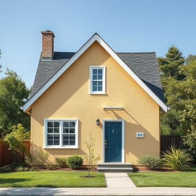
Blue and White
Perfect for coastal or traditional homes, this color combination evokes feelings of calmness and clarity. Blue siding with white trims adds a refreshing nautical vibe. It’s great for homes near the ocean or those wanting a breezy, welcoming look.
Grey and Black
For a modern, edgy aesthetic, grey walls with black trims or accents can deliver a sleek appearance. This palette is popular in urban environments and suits contemporary architecture. It also hides dirt better, which is a plus in dusty regions.
Trending House Painting Colour Combinations Outside
Olive Green and Cream
This combination is rising in popularity for its connection to nature. Olive green works beautifully with cream or off-white trims, producing a rustic yet sophisticated exterior. This is ideal for countryside homes or places surrounded by greenery.
Charcoal and Wood Accents
Charcoal grey walls with natural wood tones (doors, window frames, or pergolas) create a rich contrast that feels grounded and luxurious. This pairing bridges the gap between modern and organic design styles.
Terracotta and Beige
Inspired by Mediterranean design, terracotta paired with beige or cream gives warmth and character to a home’s exterior. This color scheme is perfect for sunny regions, as it reflects cultural charm and elegance.
Slate Blue and Pure White
Slate blue adds depth, while white creates balance. This elegant color combination works well for cottages, suburban homes, or colonial styles. It’s classy without being too flashy, making it a favorite among homeowners looking for a timeless look.
How to Choose the Best Exterior Colour Combination
Deciding on the right combination for your house painting outside requires considering a few key factors:
- Architecture Style– Classic homes often look better with traditional combinations, while modern homes can handle bold contrasts and darker shades.
- Neighborhood Guidelines– Some communities have rules or guidelines that may restrict certain colors or combinations.
- Climate Conditions– Lighter colors reflect sunlight and work better in hot climates, while darker colors absorb heat and suit cooler regions.
- Surrounding Environment– Take cues from nearby landscapes, neighboring houses, and natural elements.
Tips for Enhancing Exterior Colour Impact
Don’t Ignore the Trim
While the main house color is important, trims, doors, and shutters add depth and definition. White or black trims are versatile, but don’t hesitate to use complementary or contrasting tones to highlight architectural features.
Test Samples Before Finalizing
Paint colors often look different in natural light compared to how they appear on a sample card. Test a few patches on different sides of the house to see how they look during various times of the day.
Coordinate with Roofing and Fixtures
Ensure your color choices blend well with the roof, gutters, garage doors, and even landscaping. A harmonious exterior includes more than just walls it’s about creating a complete visual balance.
Low-Maintenance Combinations
For homeowners looking for easy upkeep, certain colors are better at hiding dust, stains, and weathering. Here are some low-maintenance combos:
- Greige and White– A soft neutral tone with white gives a fresh look while requiring minimal cleaning.
- Taupe and Dark Brown– These earthy shades hide dirt and fade more slowly in the sun.
- Slate Grey and Blue– Durable and less prone to staining, suitable for areas with rain or mud.
Creating Contrast Without Overwhelming
It’s tempting to use multiple bold colors, but restraint often leads to better results. Choose one dominant color and two accent colors to maintain harmony. A simple 60-30-10 rule can help:
- 60%– Dominant color (main walls)
- 30%– Secondary color (trim, garage, shutters)
- 10%– Accent color (doors, small details)
Exterior Colour Choices
House painting colour combinations outside are a reflection of taste, design trends, and functionality. The right palette can elevate your home’s character and value. Whether you’re going for classic, rustic, or contemporary, the colors you choose should be thoughtful and suitable for your surroundings. Take the time to evaluate your home’s style, consult professionals if needed, and visualize the impact of each color pairing before applying the first coat. In the end, your home’s exterior will be the first impression for visitors and passersby make it count.