The Coca-Cola Spencerian Script is one of the most recognizable and iconic pieces of branding in the world. It is more than just a logo it represents a century-old legacy of design, craftsmanship, and identity. The elegant swirls and flowing curves of the Coca-Cola lettering are written in a classic calligraphic style known as Spencerian script, a handwriting form popular in the United States during the 19th century. Understanding its history and design significance provides insight into how a simple typeface became a global symbol of refreshment and nostalgia.
The Origins of the Spencerian Script
Before the age of typewriters and digital fonts, penmanship was an essential skill. In the mid-1800s, Platt Rogers Spencer developed a handwriting style that became known as the Spencerian script. It was taught in schools and used in business correspondence because of its elegant yet legible form. The script featured graceful, looping strokes and smooth connections between letters, reflecting both beauty and efficiency.
The Spencerian method emphasized rhythm and flow, creating a consistent slant and delicate curvature that made writing appear polished and uniform. By the late 19th century, it was the standard for formal writing in America. When the Coca-Cola logo was designed in 1886, this script was the most fashionable and respected style of handwriting available.
The Creation of the Coca-Cola Logo
The famous Coca-Cola logo was created by Frank Mason Robinson, who was the bookkeeper for Dr. John S. Pemberton, the inventor of Coca-Cola. Robinson suggested the name Coca-Cola and designed its logo using Spencerian script. He believed that the elegant, flowing letters would look distinctive in advertisements and be easy to read. His instinct was correct the script gave the brand a refined appearance that immediately stood out.
Robinson’s version of the Spencerian script was slightly modified to fit the brand’s identity. It combined traditional calligraphic flourishes with a touch of commercial simplicity. The result was a timeless wordmark that has changed very little over more than a century. This consistency has helped Coca-Cola maintain a strong visual identity recognized by billions of people worldwide.
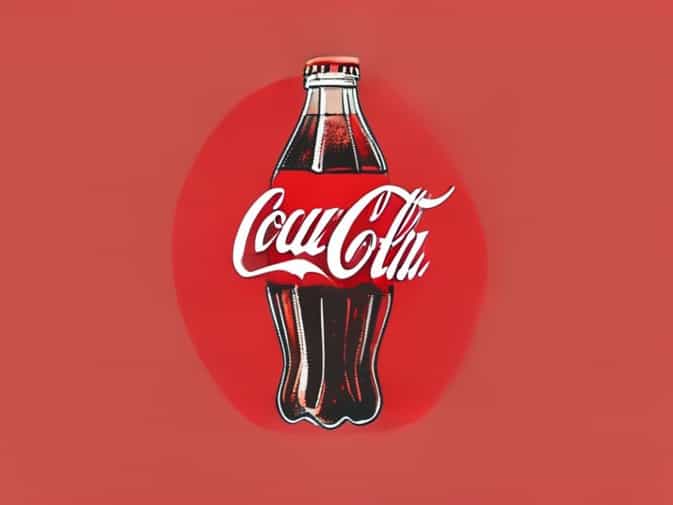
Characteristics of the Coca-Cola Spencerian Script
The Coca-Cola Spencerian script contains several unique features that make it distinct from ordinary handwriting. Each letter contributes to the overall harmony and flow of the logo, resulting in a design that feels both handcrafted and balanced.
- Elegant CurvesThe script’s rounded loops and smooth transitions create a sense of motion and liveliness, mirroring the effervescence of a fizzy drink.
- Consistent SlantLike all Spencerian writing, the Coca-Cola logo maintains a rhythmic forward slant, conveying movement and energy.
- Elongated StrokesThe extended tails on letters like C and l give the logo a flowing, connected feel that emphasizes continuity.
- Contrast in ThicknessThe variation between thick downstrokes and thin upstrokes adds dimension and visual interest to the lettering.
- Interconnected LettersThe seamless connection between letters creates unity, symbolizing harmony and togetherness values the brand often promotes.
Symbolism Behind the Script
While the Coca-Cola Spencerian script was initially chosen for aesthetic reasons, it came to embody deeper meanings. The script’s fluidity and balance evoke feelings of tradition, trust, and familiarity. It reminds consumers of a time when craftsmanship mattered, and personal touch defined quality. In many ways, the script communicates the brand’s values better than any slogan could.
The handwritten look also connects to the idea of authenticity. Even as Coca-Cola expanded globally, the logo maintained its original form, serving as a symbol of consistency. The flowing letters seem to echo the pour of a refreshing beverage, visually reinforcing the product’s sensory experience.
Evolution of the Coca-Cola Logo Over Time
Although the Coca-Cola script has remained remarkably consistent since its creation, the brand has made small adjustments to improve clarity and adaptability over time. In the early years, minor refinements were made to enhance printing quality. During the mid-20th century, designers adjusted line weights and spacing to suit mass production and packaging needs.
Despite these minor changes, the brand never abandoned the original Spencerian concept. The essence of Frank Mason Robinson’s design continues to define Coca-Cola’s identity. The logo’s endurance demonstrates how powerful a well-crafted typographic design can be, even in a fast-changing visual culture.
Spencerian Script in the Context of Branding
The Coca-Cola logo is a perfect example of how handwriting can be transformed into a timeless brand asset. Spencerian script was originally meant for personal correspondence, yet it became a global commercial symbol when applied to Coca-Cola. Its adaptability to marketing, packaging, and advertising showcases the versatility of classical design principles.
Other companies in the early 20th century attempted to emulate the success of Coca-Cola’s flowing script, but few achieved the same level of recognition. The secret lies in balance Coca-Cola’s logo manages to be ornate without being overly complicated. Its curves invite the eye to follow, and its rhythm makes it memorable even after a quick glance.
The Role of Handwriting in Visual Identity
In modern branding, digital typography dominates, yet the Coca-Cola Spencerian script reminds us of the enduring power of handwritten design. Handwriting adds personality and human warmth to a brand, something that computer-generated fonts often struggle to convey. The script’s organic form gives Coca-Cola an approachable and genuine identity, bridging the emotional gap between brand and consumer.
Even in today’s era of sleek minimalism, the Coca-Cola script stands strong. It proves that traditional craftsmanship and design rooted in history can remain relevant. The logo does not rely on trendy shapes or colors but on emotional familiarity and cultural memory.
Influence on Design and Culture
The Coca-Cola Spencerian script has influenced countless designers, typographers, and calligraphers. It serves as a study model in graphic design education, illustrating how lettering style and brand identity can align perfectly. The script’s cultural reach extends beyond commercial use it has been featured in art, music, and fashion as a representation of Americana and vintage aesthetics.
For collectors and enthusiasts, the Coca-Cola logo represents more than a beverage company; it is a symbol of design heritage. From posters and bottles to neon signs and apparel, the script continues to define visual culture associated with joy, nostalgia, and simplicity.
Preserving the Spencerian Legacy
As technology advances, fewer people practice traditional handwriting, and calligraphic styles like Spencerian script are slowly fading. However, Coca-Cola’s continued use of this script ensures that its legacy endures. The brand has indirectly helped preserve a piece of American penmanship history. Calligraphy schools and enthusiasts often cite the Coca-Cola logo as an example of how classical writing can achieve timeless beauty in the modern world.
Furthermore, Coca-Cola’s design history highlights the importance of visual continuity. While other brands frequently update their logos, Coca-Cola’s decision to maintain its original style reinforces consumer trust and emotional connection. The script remains a cornerstone of its brand story an art form that links past craftsmanship with present innovation.
Modern Adaptations and Digital Design
In the digital age, designers have adapted the Spencerian script into vector graphics and scalable digital formats while preserving its organic feel. Advanced software allows designers to reproduce the curves and strokes of the Coca-Cola script with precision, ensuring consistency across different platforms. Whether it appears on a billboard, smartphone screen, or bottle label, the logo retains its classic appearance.
This adaptation demonstrates the script’s versatility. Even with evolving media, the Coca-Cola Spencerian script remains visually strong and emotionally engaging. It bridges the gap between traditional artistry and modern technology, proving that design grounded in history can remain relevant in the future.
The Coca-Cola Spencerian script stands as one of the greatest examples of enduring graphic design. Born from a 19th-century handwriting tradition, it has become a universal symbol of refreshment, joy, and authenticity. Its elegant curves, rhythmic flow, and consistent character embody the essence of both art and commerce. More than a logo, it represents the harmony between human creativity and timeless design. As long as Coca-Cola continues to use this iconic lettering, the spirit of Spencerian craftsmanship will live on, inspiring designers and admirers around the world.