In visual art, one of the most powerful tools used to create depth, dimension, and emotion is gradation. Whether in painting, drawing, or digital design, gradation refers to a smooth transition between one color, tone, or shade and another. This concept plays a vital role in achieving realism and enhancing the viewer’s visual experience. From soft skies in a landscape to the shading of the human face, gradation is essential in both traditional and modern art practices. Understanding how gradation works and exploring strong examples can offer insight into why it remains a foundational principle in visual composition.
Understanding Gradation in Art
Definition and Importance
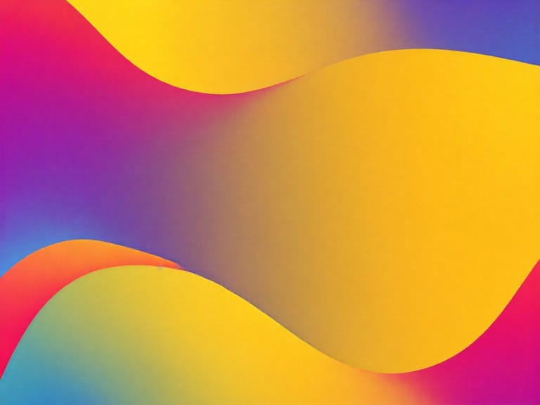
Gradation in art refers to the gradual transition from one hue, value, texture, or shape to another. This transition can be subtle or bold, but its primary purpose is to eliminate harsh lines and promote fluidity. Artists use gradation to add visual interest, simulate light, and guide the viewer’s eye through the artwork.
Types of Gradation
- Tonal Gradation: Changes in lightness or darkness to create shadow and highlight.
- Color Gradation: A smooth transition between colors, such as from red to orange.
- Shape Gradation: Increasing or decreasing the size of shapes in a sequence.
- Textural Gradation: A progression from rough to smooth or from soft to hard textures.
Example of Gradation in Art: The Great Wave off Kanagawa by Hokusai
Overview of the Artwork
One of the most iconic examples of gradation in art is The Great Wave off Kanagawa by Japanese artist Hokusai. This woodblock print, created in the 1830s, is renowned for its dramatic depiction of an enormous wave about to crash down on boats below, with Mount Fuji calmly resting in the background.
Use of Gradation
Hokusai expertly employs gradation in several areas of the print:
- Sky: The sky fades from a deep blue at the top to a pale cream near the horizon, creating depth and atmosphere.
- Wave: The wave transitions from deep indigo to white, giving it a powerful, three-dimensional form.
- Shading: The shadows under the cresting wave and within the boats use tonal gradation to suggest volume and weight.
Why It Stands Out
The smooth transitions in value and color create a sense of motion and harmony, even amid chaos. This is a testament to how gradation in art can heighten emotional impact and narrative strength without overwhelming the composition.
Gradation in Classical Painting
Leonardo da Vinci’s Mona Lisa
Leonardo’s famous portrait is a masterpiece of tonal gradation. The artist used a technique known as sfumato, which involves soft transitions between tones and colors. This method allows the subject’s face to look lifelike and ethereal at the same time.
- Facial Features: There are no sharp lines; instead, Leonardo used delicate gradation to suggest cheekbones, the bridge of the nose, and the chin.
- Background: The subtle shift in light from foreground to background creates spatial depth, drawing attention to the figure.
Effectiveness
This use of gradation lends the painting its mystery and realism. It allows the face to blend gently into the background, making the figure seem as though it is emerging from the shadows.
Gradation in Modern and Digital Art
Digital Illustration
In digital design, gradient tools are often used to create background transitions, character shading, or atmospheric effects. Digital gradation helps simulate natural lighting conditions or futuristic aesthetics, depending on the tone of the work.
Vector Art Example
In vector illustrations, artists may apply color gradients to flat shapes to give the illusion of volume. A circle filled with a radial gradient, for example, can resemble a sphere when colors shift from light at the center to dark at the edges.
Practical Uses of Gradation in Different Mediums
Charcoal Drawing
Gradation is critical when using charcoal. By varying pressure and using blending tools like a stump or finger, artists can transition smoothly from dark shadows to light highlights. This technique is particularly useful in portraiture and figure drawing.
Watercolor Painting
Watercolor artists often rely on wet-on-wet or wet-on-dry techniques to achieve color gradation. A single brushstroke might begin with a rich pigment and fade to transparency as the brush runs dry, creating a natural and organic shift in tone.
Acrylic and Oil Painting
These mediums allow more time for blending, which is essential for creating smooth gradations. Painters might use a dry brush or glazing techniques to soften transitions between colors and values.
Educational Value of Learning Gradation
Foundational Skill
Mastering gradation is essential for any aspiring artist. It improves one’s ability to depict form, light, and shadow. This skill is especially important in observational drawing, where accuracy in tonal transition defines realism.
Enhanced Visual Communication
Gradation helps in leading the viewer’s eye through the artwork. It can highlight focal points or guide movement, contributing to the overall composition’s effectiveness.
Creative Expression
Though gradation is a technical skill, it also opens doors for creativity. Artists may exaggerate or abstract transitions for stylistic effects, making their work more engaging and unique.
Exercises to Practice Gradation
- Value Scale: Create a 10-step gradient from black to white using pencil or charcoal to understand smooth tonal transitions.
- Color Blending: Mix two colors on a palette and paint a swatch that gradually changes from one hue to the other.
- Object Rendering: Choose a simple object like an apple or a ball and focus on rendering the shadows and highlights with smooth transitions.
Gradation in art is more than just a technique; it is a vital element that brings depth, realism, and movement to visual compositions. Whether you are studying a centuries-old painting like the Mona Lisa or experimenting with digital gradients in graphic design, the principles of gradation remain constant. Examples like The Great Wave off Kanagawa demonstrate how thoughtful application of gradual transitions can elevate an image, capturing both the viewer’s eye and emotion. Artists who invest time in mastering gradation unlock the ability to render the world with greater nuance, elegance, and impact. As both a foundational and expressive tool, gradation continues to be one of the most important aspects of creating compelling, professional, and memorable art.